Episode 027: Oh Beautiful Beer: highlighting the best in craft beer design

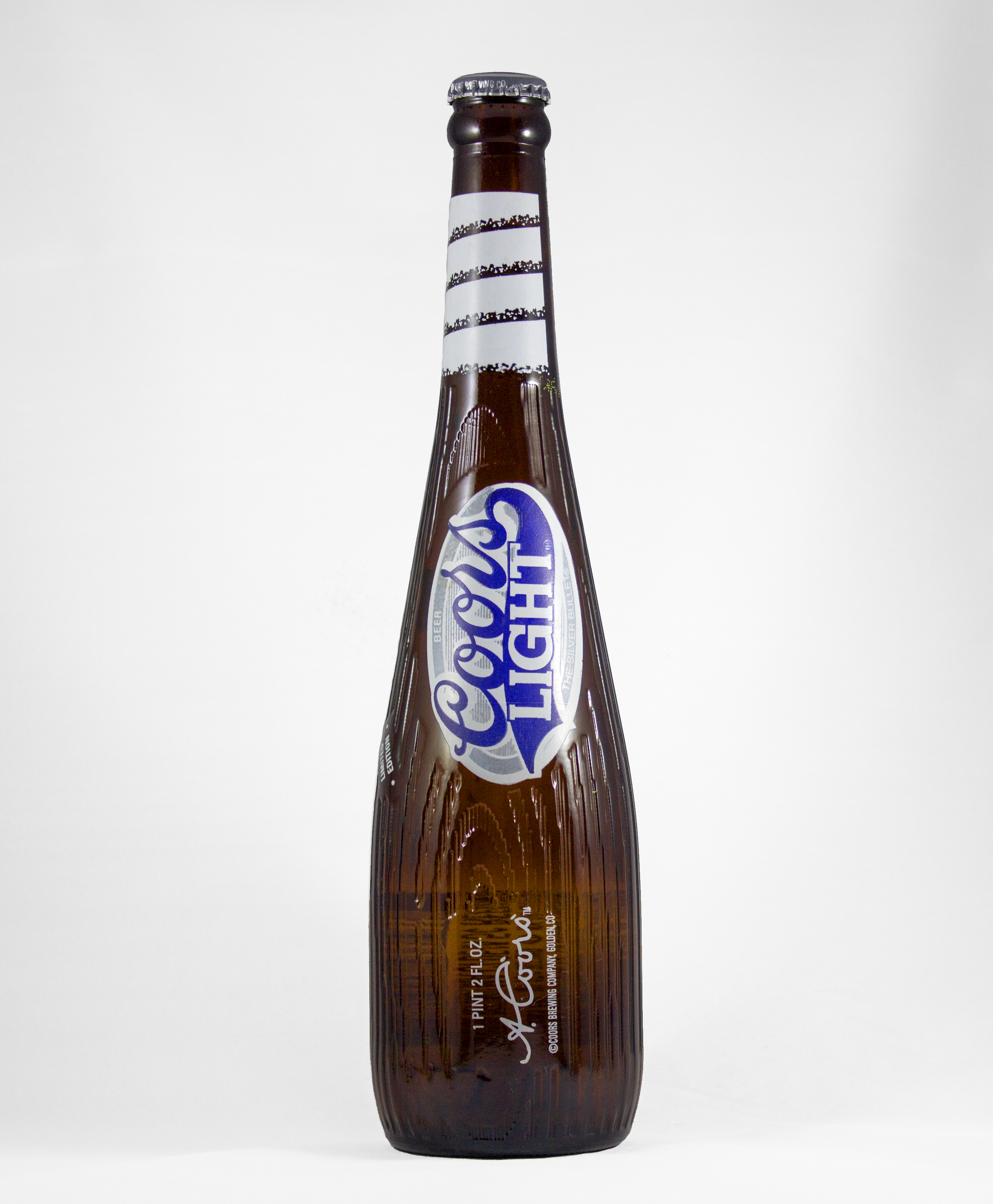
Harvey Shepard fell in love with beer packaging as a kid after gazing upon a Coors Light bottle shaped as a baseball bat.
During his college years, Harvey needed a portfolio to showcase his graphic design work. Many portfolios at the time piggybacked on blogs, so he launched Oh Beautiful Beer – a blog showcasing innovative and well-designed beer labels and packaging. Since its launch, Oh Beautiful Beer has become a central hub for highlighting the best graphics and design the craft beer industry has to offer.

Oh Beautiful’s Evolution
Harvey quickly found out in starting Oh Beautiful Beer that he had way more content than would fit in one post. At first, he had to scour the internet to find designs and packaging information. Now all Harvey has to do is open his inbox. Breweries regularly submit to the website, so the process is mostly streamlined for him now. Oh Beautiful Beer highlights the stories behind each design, and also shows sketches and mock ups. While it’s great to see what designs worked, it can be insightful to peek behind the curtain and see graphical dead ends that never get used.
Discovering Trends
While Harvey didn’t set out to discover marketing trends, Oh Beautiful Beer stands as a platform to see what’s popular in beer marketing. With over 5,000 breweries in the U.S. it’s become easy to categorize and see what patterns emerge. One that has stood the test of time is the “handmade aesthetic”. This style of labeling and packaging highlights the “I made this with blood sweat and tears” feel that many breweries encapsulate with their small town, big flavor vibe. A counter trend to this would be the ultra-sharp minimalist approach. More white space and clear lines can help a can jump off a shelf when surrounded by beers with cluttered design.
Austin Beerworks
Harvey uses Austin Beerworks to highlight good branding and packaging strategy. Before the brewery decide on a name they sat down with Helm’s Workshop – a strategic marketing design studio also based in Austin. They noticed no other breweries in the area were using “Austin” in their name, so they pounced on the opportunity.
They also ran an interesting packaging promotion that featured a “99 pack” of their Anytime Ale.
Branding & Marketing Trajectory
One of the most important aspects of creating your brewery’s brand is to be honest. If you’re straight-laced and making traditional style lagers, it doesn’t make sense to put a punk rock aesthetic on your can. Consumers can smell disingenuous marketing from your taproom’s parking lot.
More innovative ingredients and brewing methods will surely result in an increase in unique marketing. Packaging and design will grow alongside the beers they match with and provide Oh Beautiful Beer with plenty of quality content for years to come.
Notable Quote from the Interview
“I think it’s hard to really put an exact formula on it, but the brands that really embrace their visuals as their voice are going to end up being be the most successful. You know, those brands that want the outsides to look and feel like the insides.”
“I think the brands that are really successful are the ones that are keeping that shelf in mind and thinking about what’s going on there, what they’re competing with and how they can zag away from that to really stand-out”
Additional Resources
2 articles on this topic from Nielsen:
Craft Beer Drinkers Often Judge a Beer by its Packaging
Guest’s contact info:
Web: Oh Beautiful Beer
Twitter: @ohbeautifulbeer
Facebook: Oh Beautiful Beer
Instagram: @OhBeautifulBeer
Email: [email protected]
